Brand identity, explainer video & website for an eco-minded business
GREENDOCS

We were approached by Greendocs to develop their brand in preperation for their upcoming launch.
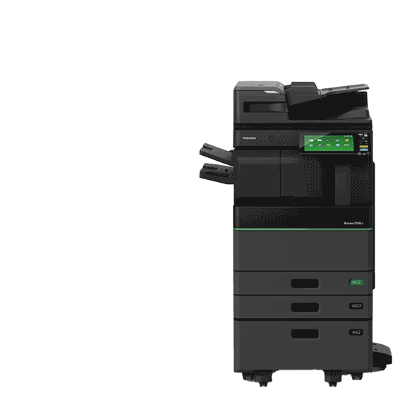
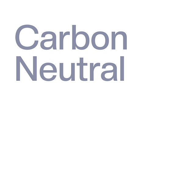
Greendocs are a forward thinking company with an eco-heart. Joining a competitive market, they have some unique USP’s to shout about - providing award-winning office products that are kind to our environment. Greendocs are a proud key partner of Toshiba, and part of their Carbon zero scheme. This helps combat CO2 emissions through the offsetting of all the products they sell. Everything they do to run as an organisation has an ‘environmental impact first' approach, from energy conservation methods, to recycling, electric vehicles, and digital processes.
WHAT WE CREATED
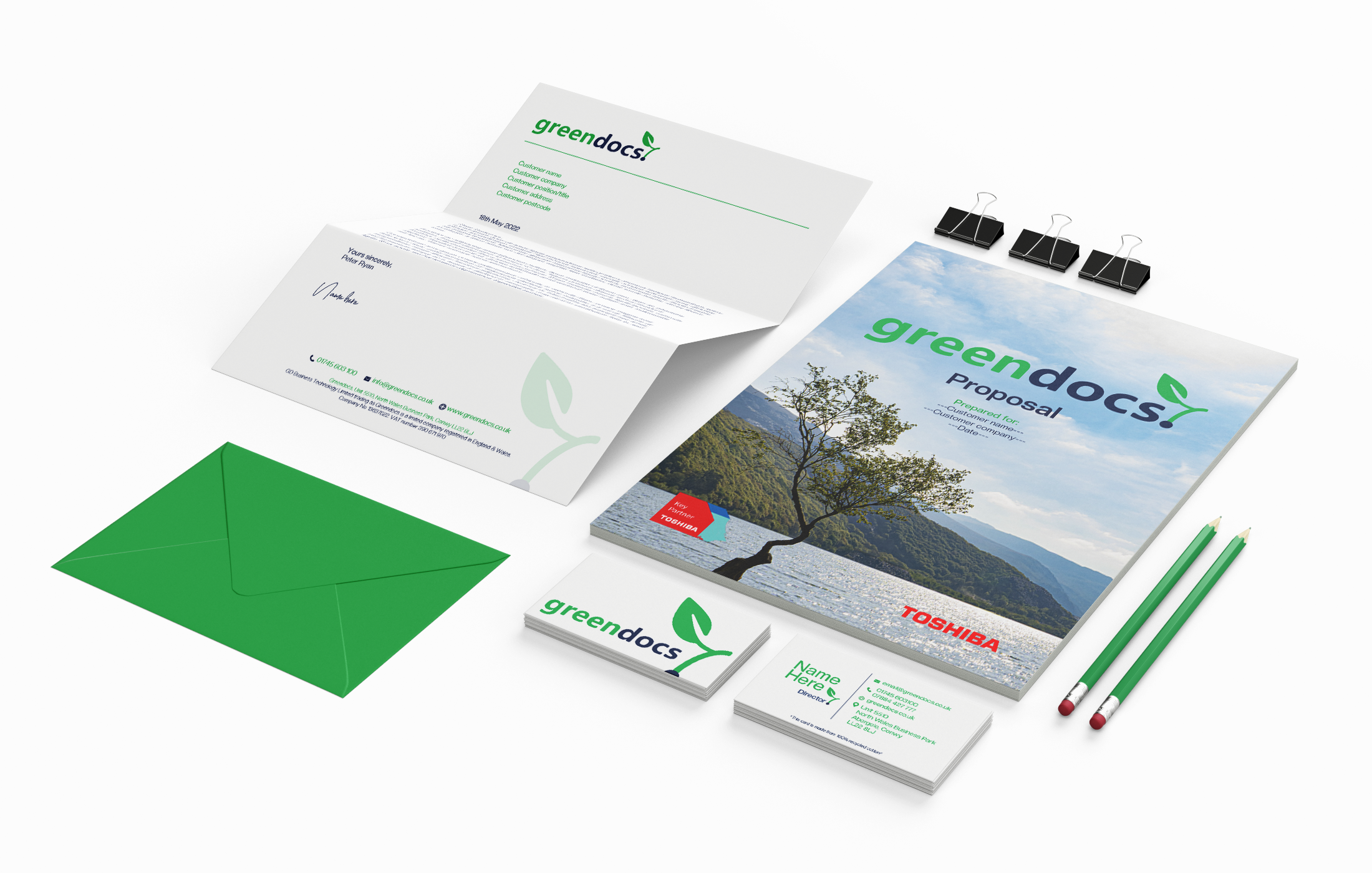
Brand development | Website design & build | Animated GIFs & motion graphics | Explainer video | Original music composition | Sound design | Branded collateral
Brand identity
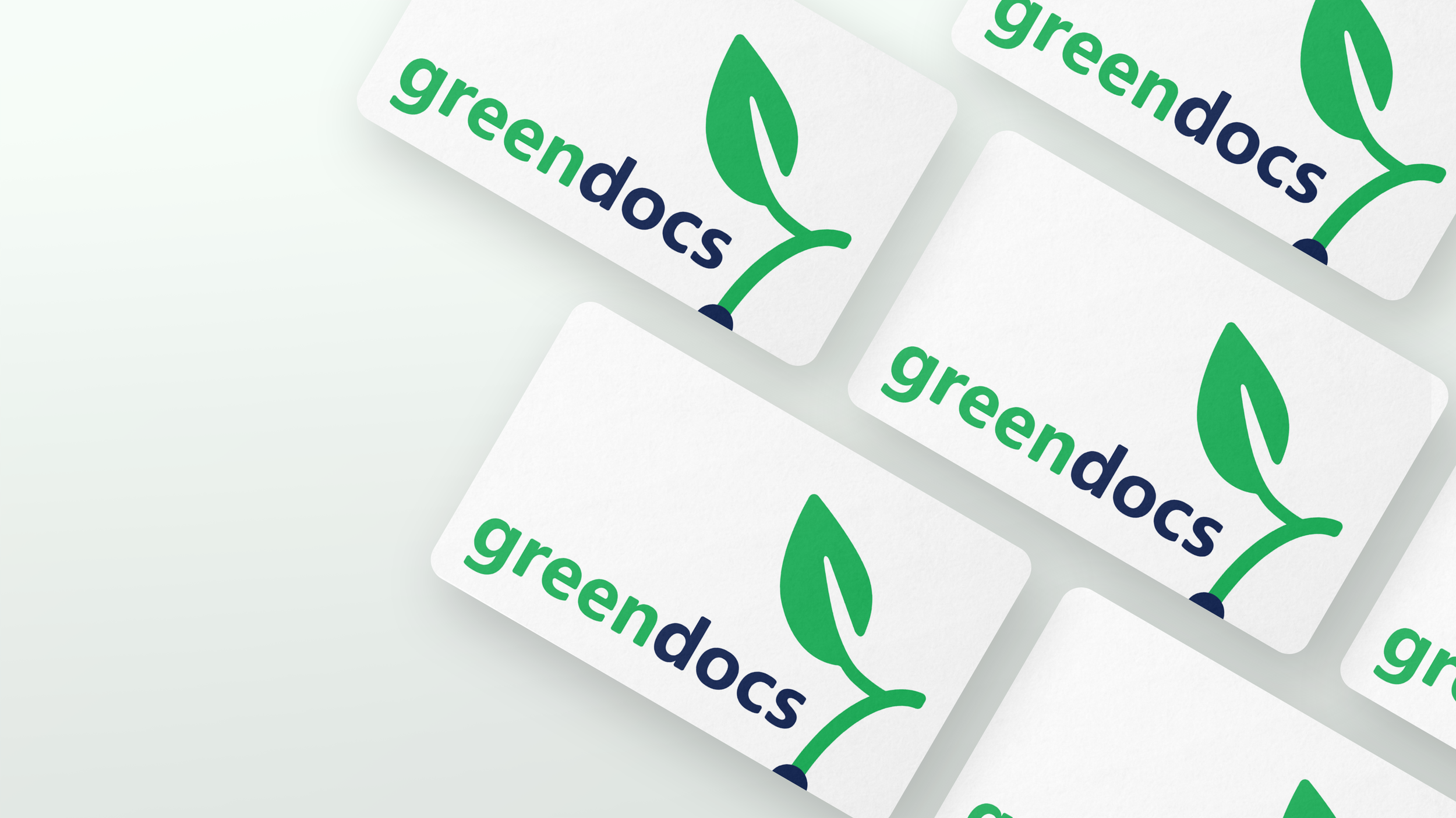
Greendocs came to us with a logo, so we developed their identity from there. The sharp corners of the original logo were rounded off to give a contemporary edge, and brought it to life with animation.
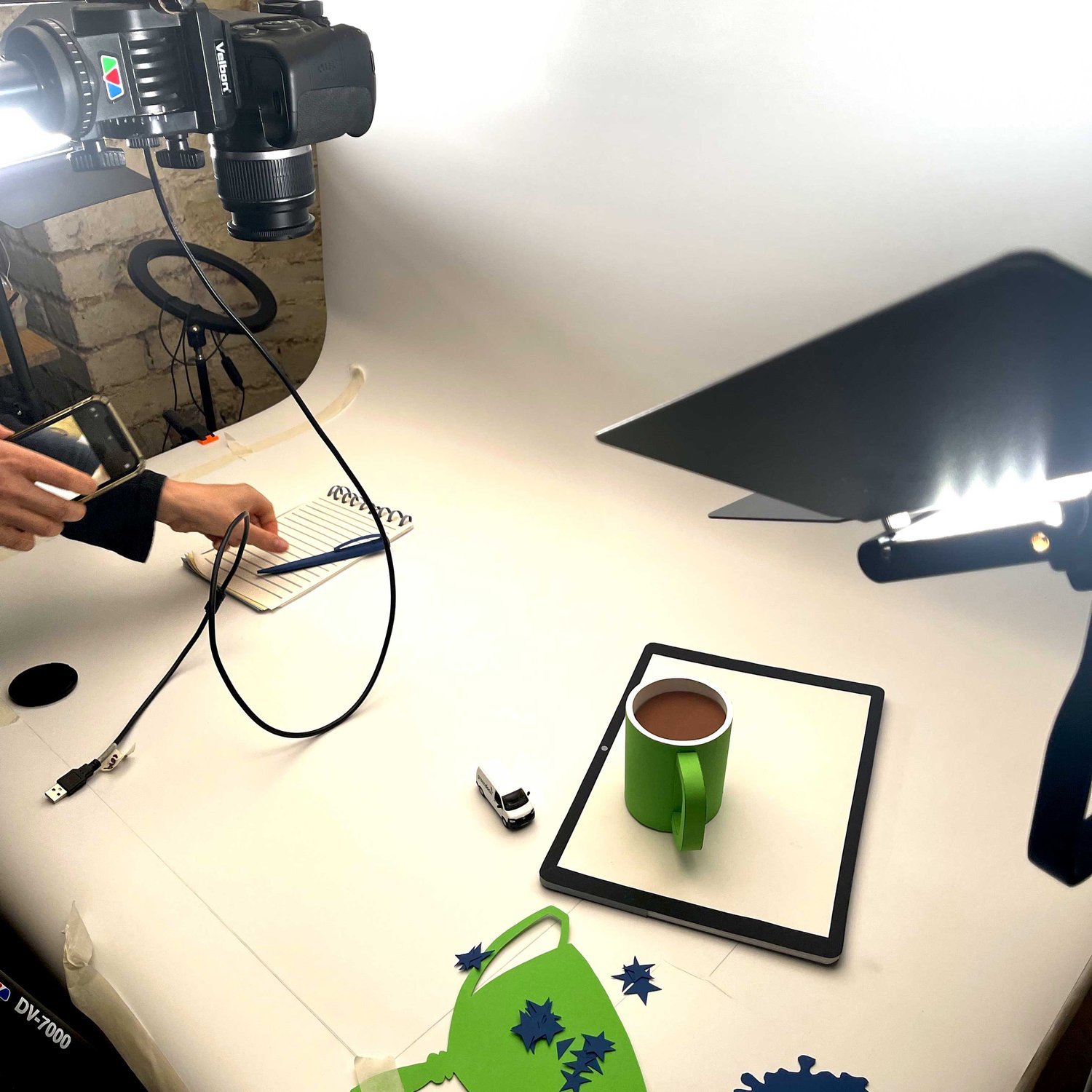
We initially developed their branding, rolling out the two-tone colour scheme contrasted with crisp White. In-line with their eco-credentials, the business cards were made from recycled cotton t-shirts! Even the video props were made using recycled papers.


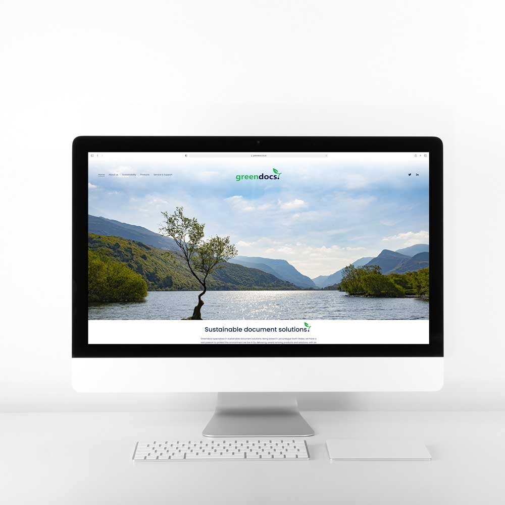
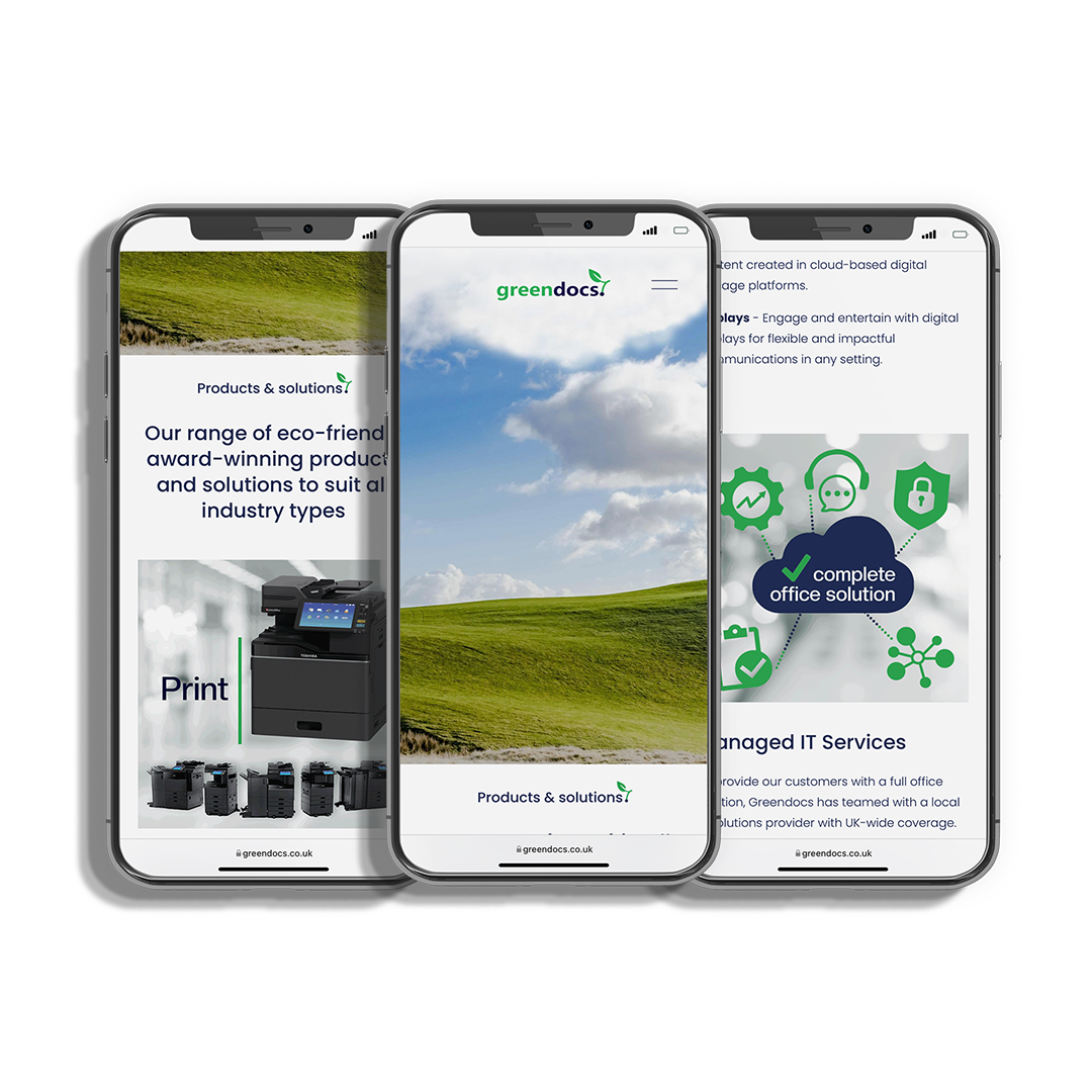
A fully responsive website
We designed and built a fully responsive website for Greendocs. A sleek and minimalist design featuring their explainer video as the company introduction. We kept it to a very simple colour palette to give a clean look which was very important to the client.
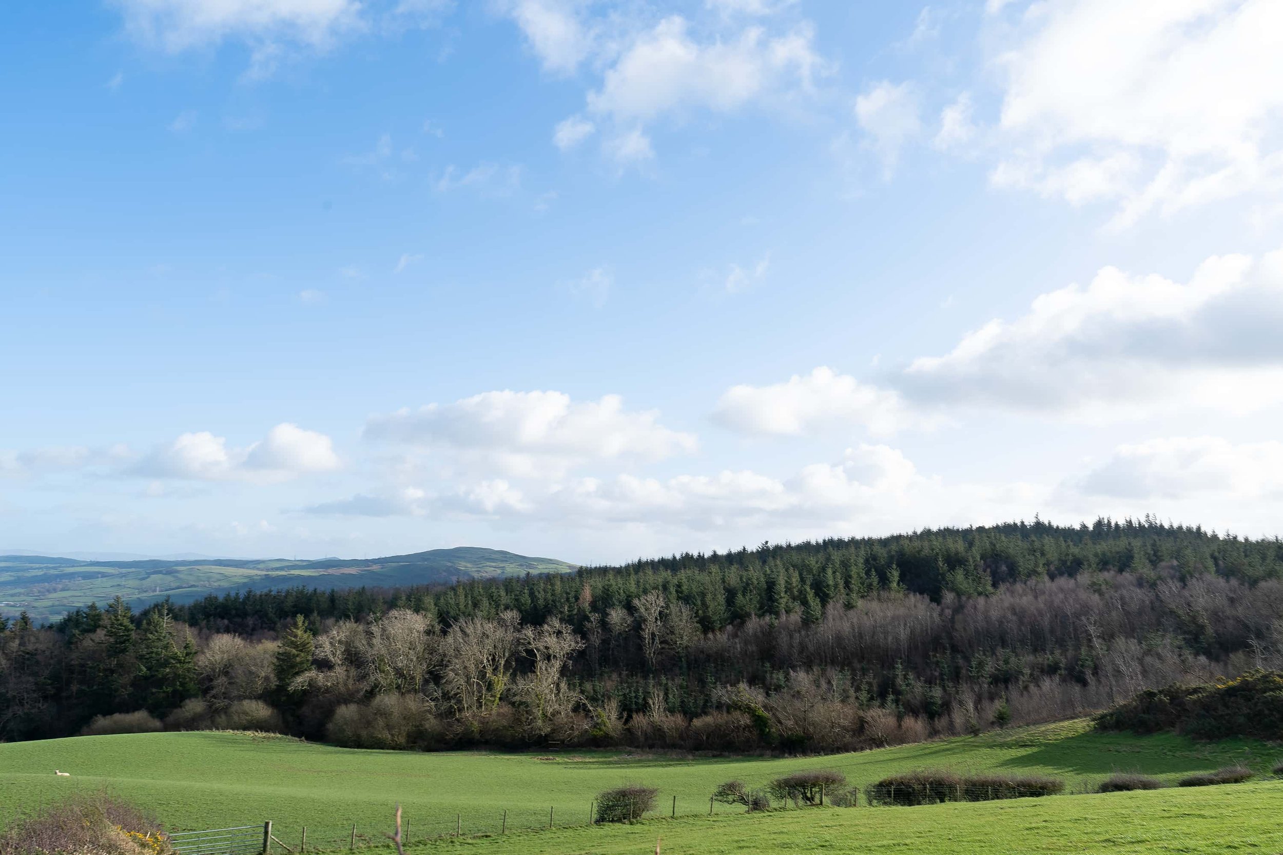
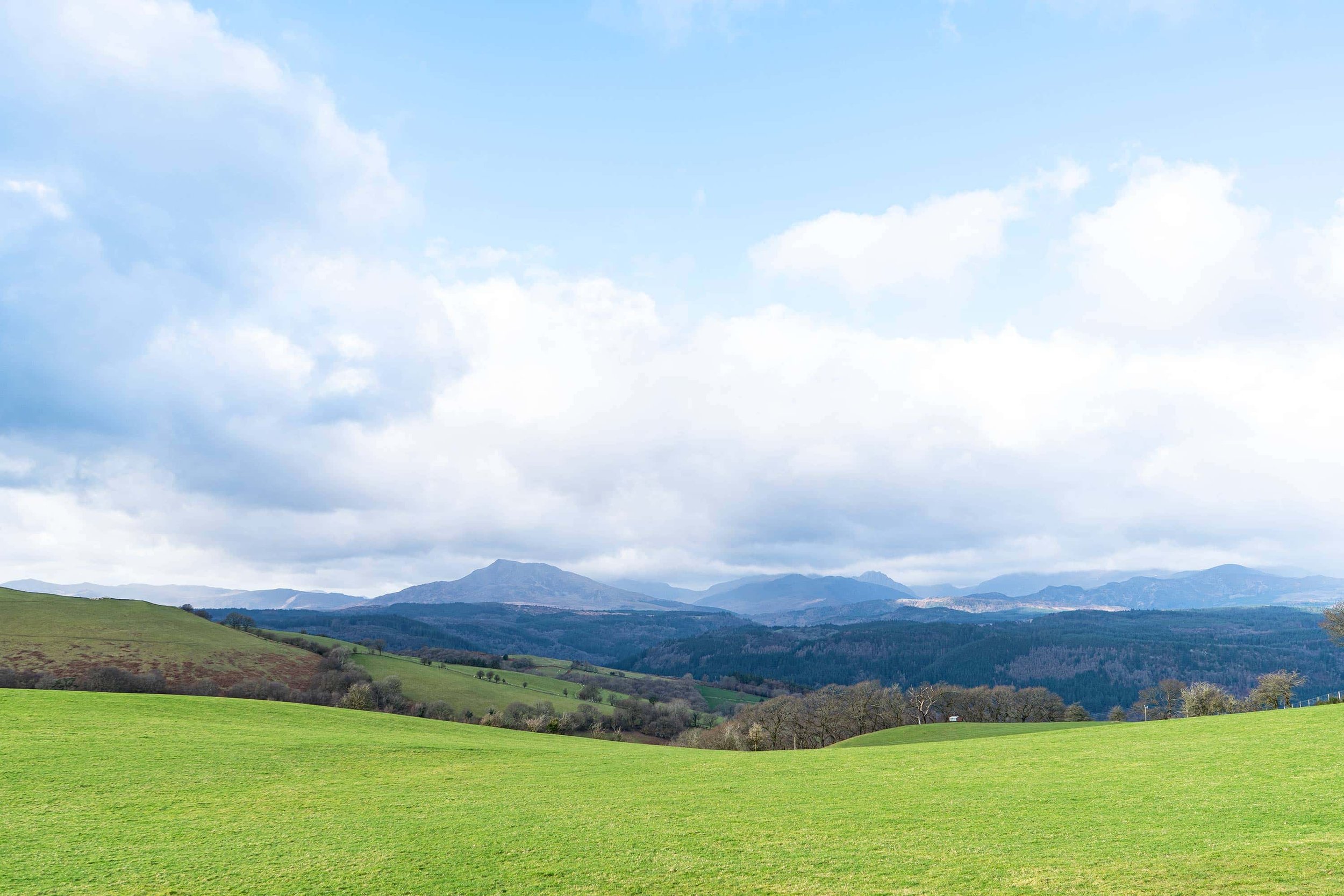
with brand photography
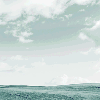
We designed and built a fully responsive website for Greendocs. We thought it was apt to feature the ‘homeland of Greendocs’ as their brand photography. Being based in stunning North Wales we were spoilt for locations! The famous Padarn Tree features on their homepage, a unique landmark nestled amongst the jaw- dropping Snowdonia range. A very green theme.


Animated GIF’s
Greendocs wanted us to bring their brand to life, so we introduced movement across their website to explain their business to potential customers. Animated GIFS are a great way of having fun with messaging, and helping people understand something quickly and easily.


The explainer video
Stop Motion Animation: Because what they offer is so unique, they asked us to create an explainer video for them. This would be sent to customers to introduce the company in an engaging way. The stop motion style was chosen because of it’s instant charm. It made it possible to explain their products and services, and highlight their passion to protect the environment.
Sound Design: We also composed an upbeat and classical style sound track, to give the animation pace and keep the viewer engaged with the explainer video.
“We can’t thank Yoke enough for their work on the project. We’d been recommended to get in touch with them, as we were in need of creative help getting ready to launch Greendocs. We had an existing logo, but not the Brand Identity to surround it. Yoke worked with the very basics we had to create a full Greendocs brand for us. We needed all collateral to be designed (letterhead, proposal templates, business cards & Powerpoint) An extensive website with bespoke brand photography and moving gifs, even an explainer video that our customers love! They took the time to understand exactly what we wanted to achieve as a company, and how we wanted to be perceived. We really feel our Greendocs branding reflects this. The work Yoke has done for us surpasses any expectations we had! We’re over the moon with it.”
— Liam Simpson, Director of Greendocs