
Designing a Visual Identity for a Creative Platform and Agency
The Brief
Micro came to us at an exciting point in their growth. With two distinct sides to the business - a team agency and a digital platform - they were looking for a visual identity that could unite both while expressing what makes each side unique. Rather than a full rebrand, they needed a bottom-up approach: a bold creative direction rooted in their landing pages that could scale over time.
The brief was open and exploratory. Micro wanted help shaping a visual world that felt characterful, modern, and collaborative. A visual language that could grow with them, and start delivering impact straight away.
The Concept
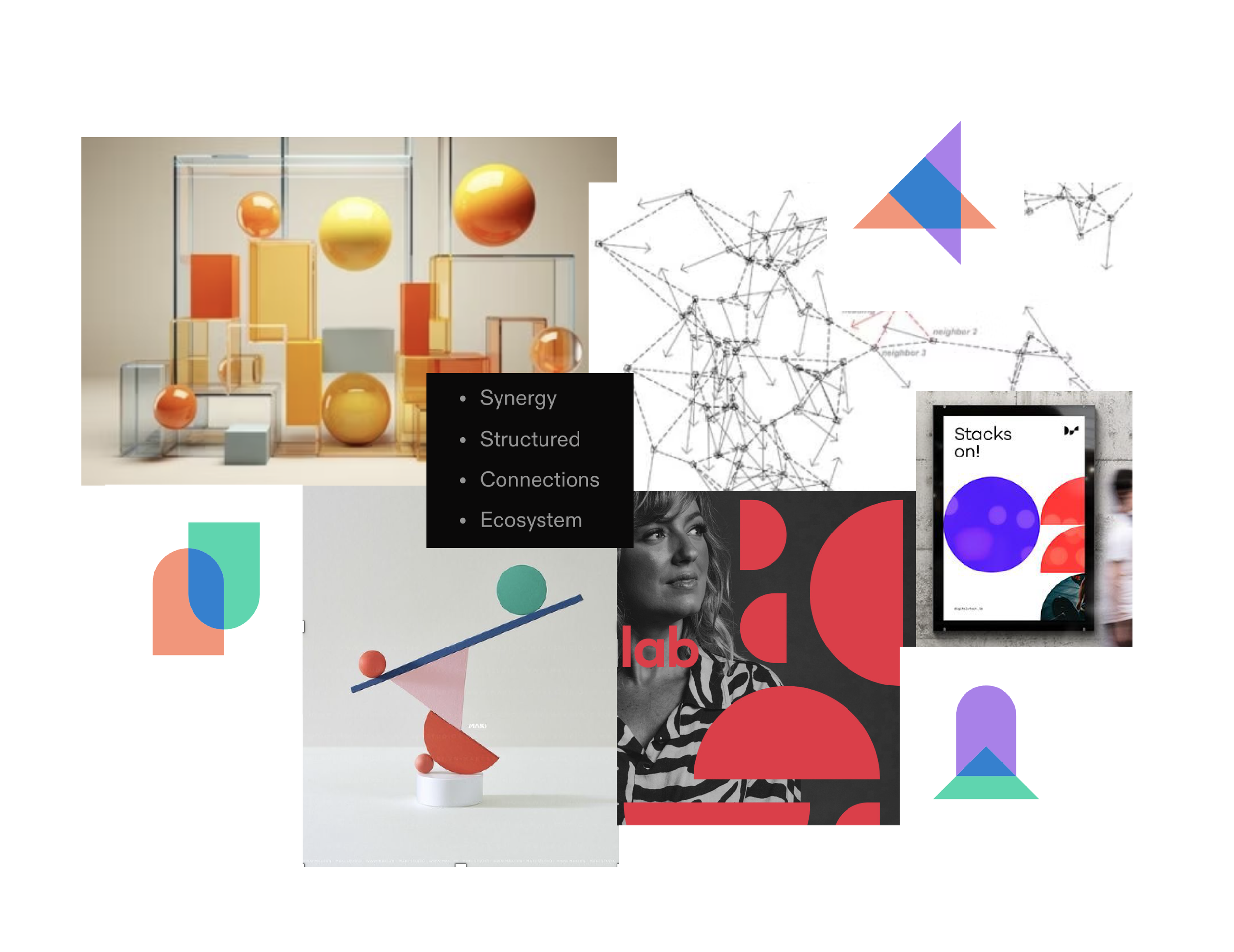
We explored two initial creative directions before landing on the chosen route: Built to Belong.
Inspired by patterns in nature - like birds flying in formation or modular systems in architecture - this concept speaks to Micro’s core belief: that small, well-structured teams can achieve big things when they’re designed to work in harmony. Micro becomes the connector, the hub that brings all the right parts together.
The visual world needed to reflect that idea. Not just in theory, but in how the brand looks, feels, and functions. We leaned into bold, geometric forms that feel strong and purposeful - a visual metaphor for collaboration, structure, and momentum.
A Logo Refresh
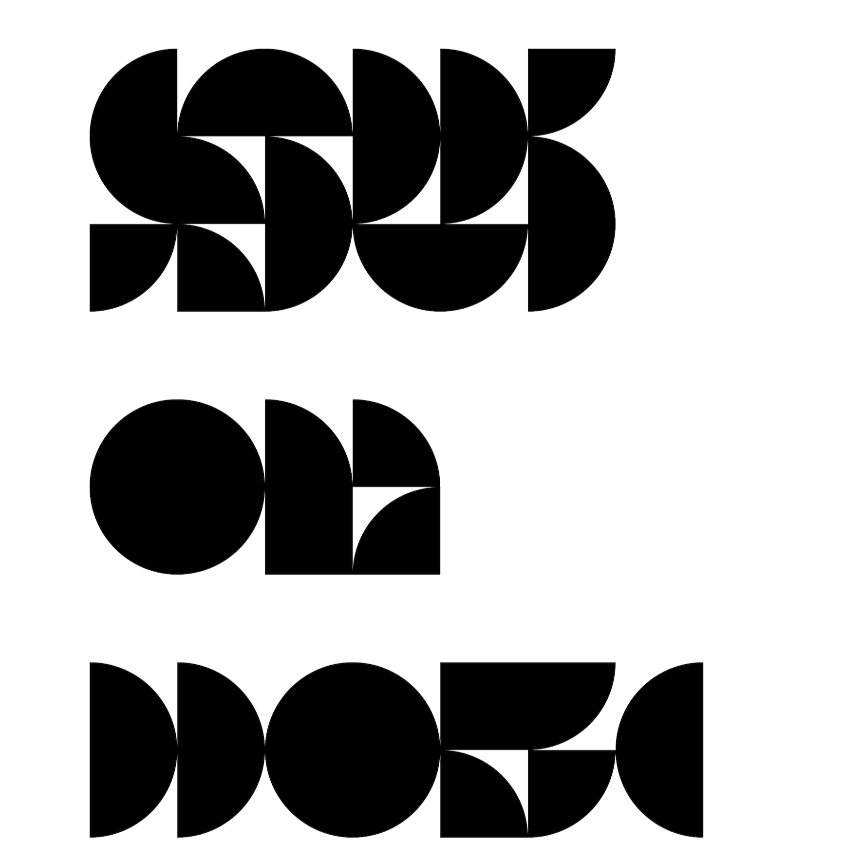
We didn’t reinvent the logo - but we did give it a refresh.
We refined the kerning and spacing for better balance and legibility, and reshaped the existing icon into clean, solid semi-circles. These shapes echo the design system used throughout the identity: simple, modular forms that feel connected and intentional. It’s a subtle shift, but one that ties the logo directly to the wider brand world, reinforcing Micro’s role as the central point of connection.
A Modular System with Energy and Purpose
The brand shapes are more than decoration, they’re working parts of a flexible visual system.
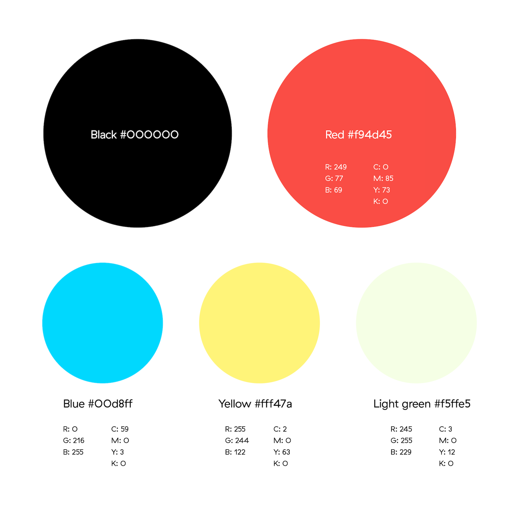
Built from bold, stackable forms, the design system reflects Micro’s modular, collaborative nature. These shapes can become icons, house photography and video, or add rhythm and structure to layouts. They help communicate ideas clearly, while giving the brand a distinctive, ownable visual language.
The colour palette is bright, confident, and full of energy. Each hue has a role, helping to organise content, guide users, or signal different sides of the business. Together, the colour and shape systems create a brand toolkit that’s expressive but practical - consistent without feeling repetitive, and ready to scale with Micro as they grow.
The Outcome
The result is a visual identity that’s designed to grow with Micro. It’s confident but approachable, structured but full of personality. Built from simple parts that come together to do something greater - just like the Micro teams themselves.
This is just the beginning of the story, but it’s a solid foundation. One that brings clarity, energy and cohesion to a business that’s all about helping great teams do great things.
